Case Study
Verizon App Design System
Building a mobile-first dynamic pattern library for iOS, Android and Web

As an iconic technology company, Verizon recognizes the significance of mobile apps in shaping the customer experience. These apps serve as a direct representation of our capabilities and should embody our brand promise. By providing instant and intuitive access to a diverse range of useful services and personalized information, our mobile apps empower customers. To achieve this, the Verizon design language and behavior principles presented here play a pivotal role in strategically optimizing the app and placing the user at the center. Moreover, these principles are designed to be flexible and adaptable, capable of meeting the evolving needs of an ever-changing industry.
Strategic Goals
- Establish comprehensive principles and standards for mobile application development, encompassing business, brand, and technology partners.
- Strengthen Verizon's position as an iconic technology brand by reinforcing the "Empowering Advisor" brand behavior and implementing a unified mobile design and experience system.
- Prioritize a user-centric approach that empowers customers, optimizes functionality, maintains flexibility, and aligns with strategic objectives.
Target users
Project managers
Copywriters
UX designers
Visual designers
Developers
Internal Verizon
Verizon partners
Copywriters
UX designers
Visual designers
Developers
Internal Verizon
Verizon partners
App Platform
︎ Android ︎iOS
Platform
Mobile, Pad/Tablet
App Properties
Niche Misc
Verizon FIOS Mobile
Hire Our Heroes
Hopeline from Verizon Thinkfinlty Community Verizon Center
Verizon Governemnt Directory Verizon Concierge
Verizon FIOS Mobile
Hire Our Heroes
Hopeline from Verizon Thinkfinlty Community Verizon Center
Verizon Governemnt Directory Verizon Concierge
Utilities
Verizon FIOS Mobile
Verizon BackupShare
Visual 141
VZ Navigator
Verizon Home Control Verizon Cloud
Verizon Family Locator Verizon Support & Protection Verizon Roadside Assistance Verizon FamilyBase
Verizon FIOS Mobile
Verizon BackupShare
Visual 141
VZ Navigator
Verizon Home Control Verizon Cloud
Verizon Family Locator Verizon Support & Protection Verizon Roadside Assistance Verizon FamilyBase
Entertainment/Social
Verizon FIOS Mobile Verizon Spotlight on FIOS Redbox Instant by Verizon Tones
INDYCAR13
NFL Mobile
Verizon Messages Accessory
Store
Verizon FIOS Mobile Verizon Spotlight on FIOS Redbox Instant by Verizon Tones
INDYCAR13
NFL Mobile
Verizon Messages Accessory
Store
Ideation & Process
Stakeholder Interviews
Conducted in-depth interviews with 10 key stakeholders, including product teams for Navigator, Family Base, Messages, Cloud, My Verizon, My FIOS, Support & Protection, as well as device marketing, user interface, and IT groups.
App trends analysis
App Competitive, Best Practice Audit
Thoroughly tested 85 apps from Verizon and its top five competitors, covering smartphones and tablets across all major operating systems. Identified gaps and uncovered opportunities to enhance Verizon's mobile app ecosystem.
App Technology Landscape
Explored the latest trends in mobile web and app development. Provided a comprehensive overview of current development approaches and considerations relevant to Verizon's objectives.
Conducted in-depth interviews with 10 key stakeholders, including product teams for Navigator, Family Base, Messages, Cloud, My Verizon, My FIOS, Support & Protection, as well as device marketing, user interface, and IT groups.
App trends analysis
-
Conducted extensive research from various reliable sources.
- Analyzed and synthesized crucial trends that have a direct impact on current and future Mobile App development.
App Competitive, Best Practice Audit
Thoroughly tested 85 apps from Verizon and its top five competitors, covering smartphones and tablets across all major operating systems. Identified gaps and uncovered opportunities to enhance Verizon's mobile app ecosystem.
App Technology Landscape
Explored the latest trends in mobile web and app development. Provided a comprehensive overview of current development approaches and considerations relevant to Verizon's objectives.
Deliverable
1. Guideline
2. App components
3. Web components
3. PSD files
The list of App components includes the following:
Top Bar,Drawer Navigation, Tab Navigation, Tabs, Lists, Accordion, Carousel, Launcher Screen, Tooltip, Error Warnings Confirmations, Selectors, Buttons/Links, Sort/Filter, and Input Fields.
The list of Web components includes the following:
Accordion, Anchor Links, Buttons & Links, In-Page Carousel, Errors, Warnings & Confirmations, Input Field, Loading Indicator, Selectors (Checkboxes, Radio Buttons, Select Menus) Module Level Tab, Page Level Tabs, and Tooltips
︎ Documentation provided on request
Verizon Brand Central
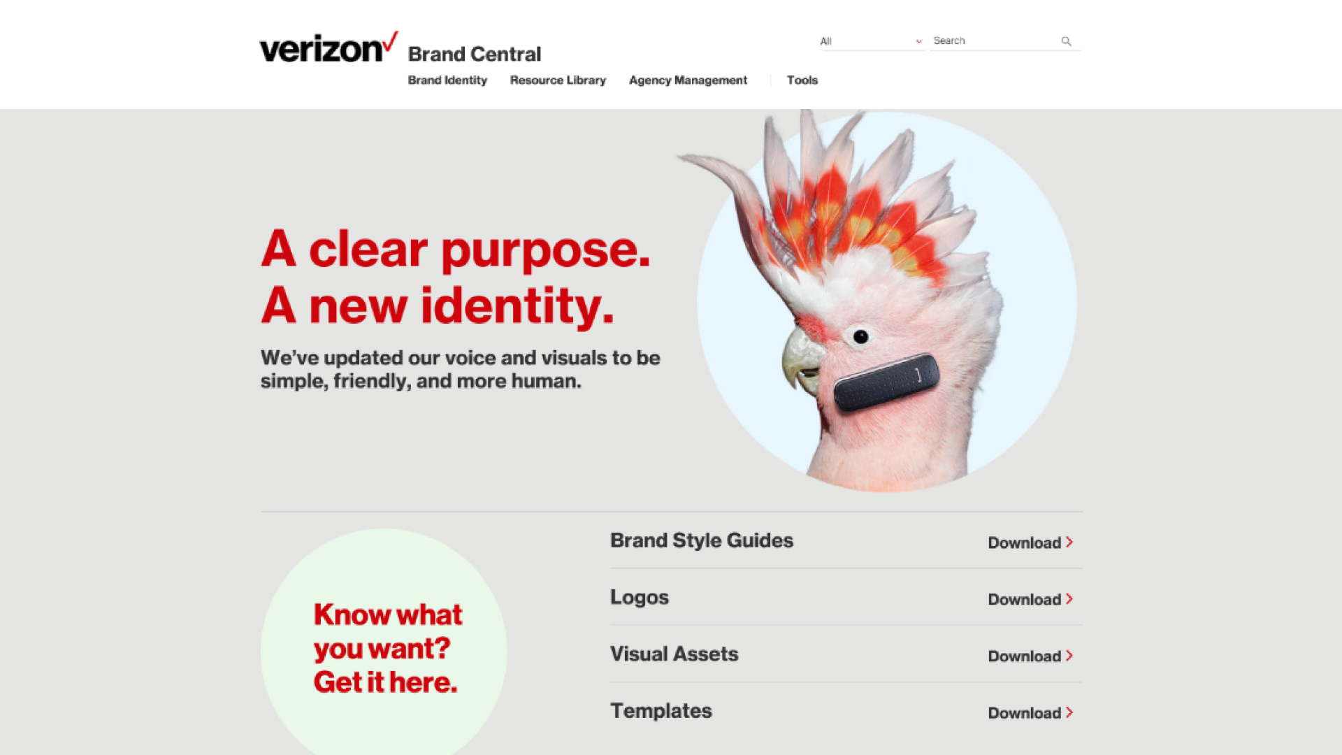
Brand Central is the go-to platform for users seeking mobile app components and design assets, providing a centralized hub for designing captivating and impactful mobile apps.

App Component
Top Bar
is a versatile navigation and information hub, enabling seamless navigation, providing descriptive page overviews, and offering contextual actions for efficient interaction with objects or items.
is a versatile navigation and information hub, enabling seamless navigation, providing descriptive page overviews, and offering contextual actions for efficient interaction with objects or items.

App Component
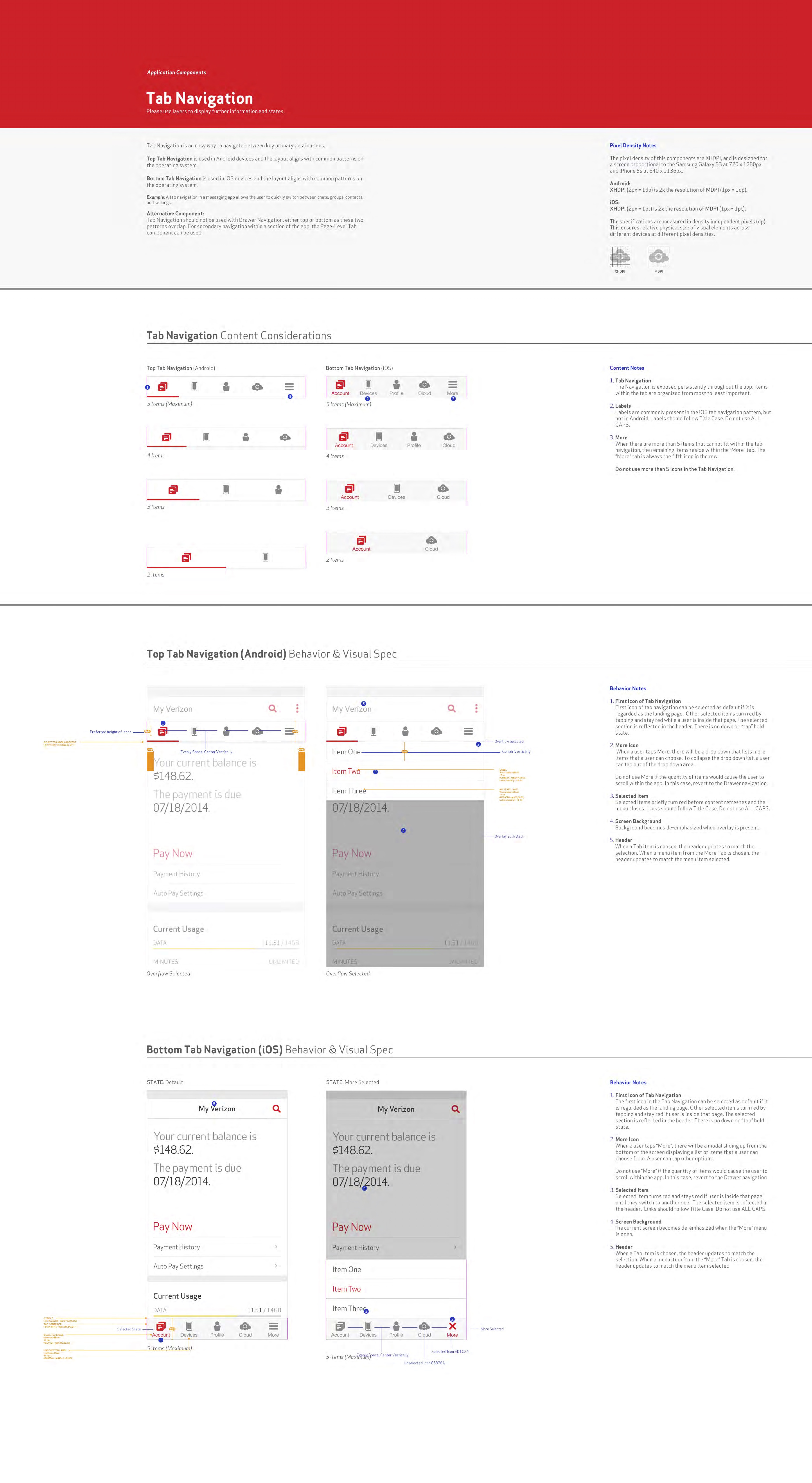
Tab Navigation
ideal for apps with a simple structure, where displaying information one page at a time is sufficient due to the relatively small number of pages. It is a suitable choice when the user does not need to consume information in a linear fashion and when having an always-present navigation will not disrupt the user experience.
ideal for apps with a simple structure, where displaying information one page at a time is sufficient due to the relatively small number of pages. It is a suitable choice when the user does not need to consume information in a linear fashion and when having an always-present navigation will not disrupt the user experience.

